Question
In: Statistics and Probability
On this worksheet, make an XY scatter plot linked to the following data: X 22 48...
On this worksheet, make an XY scatter plot linked to the following data:
X 22 48 37 30 24 10 42 30 41 29 16 36 45 11 31 26 31 33 46 22 13 22 32 49 35
Y 3872 9312 5217 4230 4536 1820 8274 121 6314 3828 2448 6156 7515 1309 3534 4576 5797 4983 6670 2464 2197 3278 5408 7497 5705
Add trendline, regression equation and r squared to the plot. Add this title. ("Scatterplot of X and Y Data") The scatterplot reveals a point outside the point pattern.
Copy the data to a new location in the worksheet. You now have 2 sets of data. Data that are more tha 1.5 IQR below Q1 or more than 1.5 IQR above Q3 are considered outliers and must be investigated.
It was determined that the outlying point resulted from data entry error. Remove the outlier in the copy of the data.
Make a new scatterplot linked to the cleaned data without the outlier, and add title ("Scatterplot without Outlier,") trendline, and regression equation label. Compare the regression equations of the two plots.
How did removal of the outlier affect the slope and R2?
Solutions
Expert Solution
This is a simple problem of visualization of a data with the help of a scatter plot and to appriciate the change in the quality of the data inference based on removal of outliers from it.
We shall start with a plot (scatter) of the raw data and measure the various attributes of the curve/straight line .
Then we take out the outliers and then try to see the improvement in the quality of the prediction of the curve.

Now that we have developed a scatter plot
let us make a scatter plot based on clean data.
This will be done as per the requirement of the question
We need to weed off all values lower than Q1-1.5IQR and higher than Q3+1.5IQR
IQR (inter quartile range) is given by Q3-Q1
I took the help of QUARTILE function in excel to find out the quartiles of X and Y as shown below.
| Quartile | X | Y |
| Q1 | 22 | 3278 |
| Q3 | 37 | 6156 |
IQR (X) =37-22=15
IQR(Y)=6156-3278=2878
Now for X
Q1-1.5IQR=22-1.5*15 =-0.50
Q3+1.5IQR =37+1.5*15=59.50
So we take all values between -0.50 to 59.50
For Y
Q1-1.5IQR=3278-1.5*2878 =-1039
Q3+1.5IQR =6156+1.5* 2878=10473
We take all values between -1039 to 10473
Clearly the X =30 ,Y =121 is the outlier and has to taken out.
We again make a new scatter plot as below
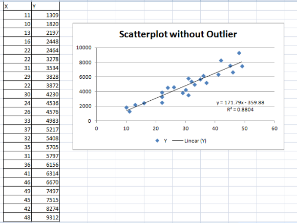
now compare the two plots.
clearly the R squared has moved up from 73.19% to 88.04 % meaning that the scatter best fit trend line can now explain more variablity between the actual and predicted value .Hence the straight line in second plot is a better fit .
 orchestra answered 3 years ago
Related Solutions
On this worksheet, make an XY scatter plot linked to the following data: X Y 92...
17) On this worksheet, make an XY scatter plot linked to the following data: X Y...
On this worksheet, make an XY scatter plot linked to the following data:1.01,2.8482, 1.48, 4.2772, 1.8,...
For the following data (a) display the data in a scatter plot, (b) calculate the correlation...
Below are four bivariate data sets and the scatter plot for each. (Note that each scatter...
1.) Sketch a scatter plot from the following data, and determine the equation of the regression...
a. Construct a scatter plot of the data. Determine the order of the polynomial that is represented by this data.
Use the following data to: draw a scatter plot, find the coefficient correlation, find the regression...
Show all working. Use the following data to: a) draw a scatter plot b) find the...
Find the equation of the regression line for the given data. Then construct a scatter plot...
- mr. smith completed 9 years of fixed monthly payments of 3,333.28 on a 30 year loan...
- during the experiment, a student did not follow the procedure exactly as directed how will eact...
- Assume all temperatures to be exact, and neglect significant figures for small changes in dimension. When...
- why is Argentina a developing country ?
- Calculate the enthalpy of the reaction 4B(s)+3O2(g)?2B2O3(s) given the following pertinent information: B2O3(s)+3H2O(g)?3O2(g)+B2H6(g), ?H?A=+2035 kJ 2B(s)+3H2(g)?B2H6(g),  
- Do you think that CAFTA will have a major impact on the U.S. economy? Why?
- Assignment 4, Fraction Comparable Instructions For this assignment, you will be updating the Fraction class from...