Question
In: Computer Science
plot this data into a bar graph: PYTHON data=pandas.read_csv(r'data/tv_shows.txt', low_memory=False) print((data)) print((data.columns)) TV Shows : Rating...
plot this data into a bar graph: PYTHON
data=pandas.read_csv(r'data/tv_shows.txt', low_memory=False)
print((data))
print((data.columns))
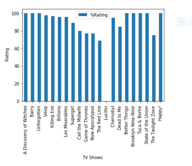
 TV Shows : Rating
0           ---------------------
1   A Discovery of Witches : 100%
2                    Barry : 100%
3              Unforgotten : 100%
4                      Veep : 98%
5               Killing Eve : 97%
6                  Billions : 96%
7            Les Misérables : 96%
8                 Supergirl : 89%
9          Call the Midwife : 80%
10          Game of Thrones : 77%
11           Now Apocalypse : 77%
12             The Red Line : 69%
13         Lucifer : No Score Yet
14                Chernobyl : 95%
15               Dead to Me : 85%
16           Better Things : 100%
17      Brooklyn Nine-Nine : 100%
18           Tuca & Bertie : 100%
19      State of the Union : 100%
20        The Twilight Zone : 75%
21                  Happy! : 100%
Index(['TV Shows : Rating'], dtype='object')
In [9]:
display(data)
Solutions
Expert Solution
Few modifications in the text file
1.I changed normal spaces to Tab spaces in each line
2.I changed'Les Misérables' to 'Les Miserables'
TXT FILE:
TV Shows : Rating
0 ---------------------
1 A Discovery of Witches : 100%
2 Barry : 100%
3 Unforgotten : 100%
4 Veep : 98%
5 Killing Eve : 97%
6 Billions : 96%
7 Les Miserables : 96%
8 Supergirl : 89%
9 Call the Midwife : 80%
10 Game of Thrones : 77%
11 Now Apocalypse : 77%
12 The Red Line : 69%
13 Lucifer : No Score Yet
14 Chernobyl : 95%
15 Dead to Me : 85%
16 Better Things : 100%
17 Brooklyn Nine-Nine : 100%
18 Tuca & Bertie : 100%
19 State of the Union : 100%
20 The Twilight Zone : 75%
21 Happy! : 100%
CODE:

import matplotlib.pyplot as plt
import csv
import pandas as pd
tvshows = [] #for storing names of tvshows
rating = [] #for storing the ratings
Label = []
with open('asd.txt', mode='r') as csv_file:

    data = csv.reader(csv_file,delimiter='\t') #remove tab space in lines
    line_count = 0

    for row in data:
        line_count += 1
        if(line_count==1):# if we are on first line then we store the names of X and Y labels
            la = row[0].split(':')
            #print(la)
            Label.append(la[0])
            Label.append(la[1])
        if(len(row)==2) and line_count>2: #this 'if' is to ignore the line '0 -------'
            arr = row[1].split(':') #we split with : as delimiter and store them in arr and row[1] means we are ignoring the
            #serial number and starting from name of tvshows in each row

            tvshows.append(arr[0]) #name of tv shows and arr[1] stores percentage of rating

            sarr = arr[1].strip('%')#we removed % for making it easier to plot in bar graph as we require int values
            if sarr == ' No Score Yet':
                sarr = '0'
            rating.append(int(sarr)) #converting string to int
#now plotting
plt.figure()
df = pd.DataFrame({'%Rating':rating}, index=tvshows)# first argument takes the number of bar plots(we require only one) and
#second argument takes the variables for which we are plotting
ax = df.plot.bar() #bar graph
plt.xlabel(Label[0]) #xlabel
plt.ylabel(Label[1]) #ylabel
plt.show()
 venereology answered 6 months ago
Related Solutions
(b) For a study of TV shows, you obtain the rating, market share, and advertising revenue...
Use python 2.7 & plotly (dash) to draw bar/line graph for below data OrderedDict([('0K', 7.239253544865276), ('PK',...
A survey on ownership of satellite TV systems shows the following data:
Deseasonalize the data by calculating the centered moving average. Plot the deseasonalized data on the graph...
Consider as SAMPLE data: 52,84,86,91,96,96,98,100,103,105,109. 1) What graph is better - bar graph or histogram? 2)...
python code: Create a phase plot of a damped driven pendulum using odeint. Show a graph...
This is in Python, I am trying to create a new window to print the data...
3. (Exercise 3.4) Use the Marriage data from the mosaicData package a) Create a bar plot...
How do you graph outliers on a box plot when given a data set of numbers?...
I'm working on a scatter-plot program in Python using Pandas, Matplotlib, Numpy, etc. I'm pulling data...
- Jeremy earned $102,100 in salary and $8,100 in interest income during the year. Jeremy’s employer withheld...
- Some bacteria only have capsules while actively infecting a host but not when grown in a...
- College physics 1) A 600 g model rocket is on a cart that is rolling to...
- I- + NO3- ? I2 + NO Note: I2 is elemental Indicate the numeric coefficient in...
- STOICHIOMETERY QUESTION :-When aluminum metal is added to sulphuric acid, hydrogen gas and aluminum sulphate is...
- Constructa 99% confidence interval for the population mean, µ, AND State what type of Interval you...
- Bob Loblaw and Wayne Jarvis get together to form a new corporation. They each own 50%...